Menu

0
Your Cart is Empty

Your Cart is Empty

March 16, 2017 4 min read 0 Comments
The creative process behind each piece of Magic art is unique to the image and the artist.
From the art description to the final product, the Art in Focus series reviews every step involved in crafting the art of Magic the Gathering in the artist’s own words.
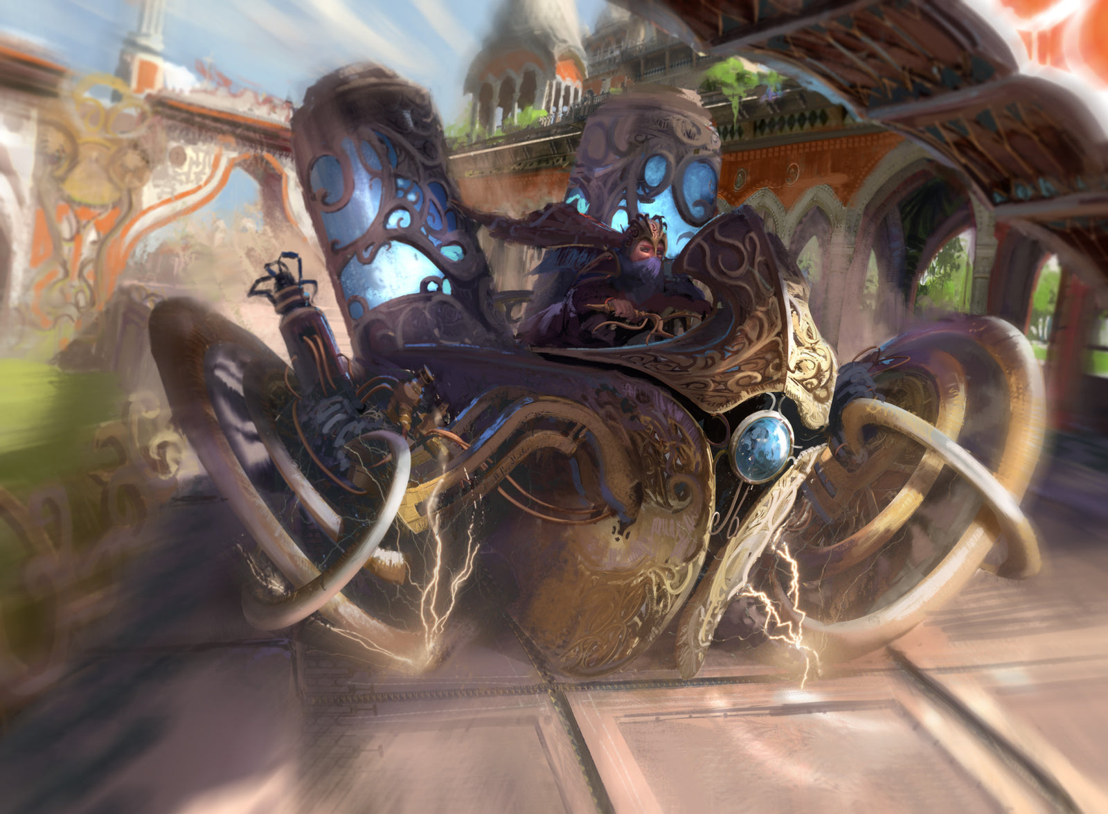
This week we shine the spotlight on the Daredevil Dragster by Titus Lunter from Aether Revolt.
Take it away Titus.
As always, this piece started with the brief from Wizards of the Coast
Art Description:
Setting: KALADESH
Color: colorless artifact - vehicle
Location: beside a canal in the city
Action: This is a shot of a racing vehicle that has been modified for even greater engine power-to the point that it is clearly dangerous. Start with the vehicle from the reference packet, but add two enormous tanks of aether to it. The aether tanks glow bright blue. Show it zooming along the bank of a canal in the city. The driver is the human female from the reference packet, only she's wearing her helmet.
Focus: the modified racing vehicle
Mood: It wasn't designed for this much power, but it sure does go fast!
As you can see the art direction was about conveying the speed and also link to a pre-existing artwork done for Kaladesh.
One of the first things I did was look at that piece to see what I had to work with. The original sketches of the vehicle were very cool but also hard to interpret.

This is half the fun of doing one of these briefs. I had a bit of trouble getting the perspective of the vehicle right as evidenced by the fact that I had to redo the wheels many times. Hitting that note was the most difficult part.

I had a lot of pictures that my in-laws took when they went to India which I used to get a sense of the architecture. It served as a great starting point to move on from there since Kaladesh had some distinct differences with the real thing. From there it was pretty easy. I had a composition in my head which was all about almost running the camera over. We needed to see it from the front so that automatically eliminated a lot of options.

With this piece I felt like I hit the nail on the head in terms of what I wanted to achieve and that is quite rare at best.
There are a lot of moving parts, pun intended, with every image but this had quite a bit of pressure on it. Fitting a complicated brief on a tiny square and have it recognizable to players is one of the most fun challenges that working for Wizards brings to the table. Being able to add your own flavor to the worlds of Magic: The Gathering is a cherry on top - especially as a player.

One mantra within the art world is: Do not paint what you see, rather paint what you see. This piece allowed me to do that.
What I saw was pieces shaking off, a sense of great speed, danger and flashing bright colors. Real motion blur doesn't work this way - it isn't as selective. Real canals don't have this weird combination of racetrack, walkway and thing decorated railing - but here it was exactly what was required in order to sell this vehicle.

One of the most successful elements for me is that it's clearly identifiable. I was really worried it would turn into a garbled mess because of all the detail - of which I added too much - but it came out pretty OK.
It's not my favorite piece that I've done for Kaladesh, which was a joy and nightmare to work on at the same time, but I did learn a lot.

In this block I wanted to move away from using photo's like I did before in my job as a concept artist where speed and photorealism are at the top of the priority list most of the time. It's funny because looking back I can clearly see where I shifted.
Daredevil Dragster is using the old method.
Invention of Malice is me flailing my arms around painting everything but not knowing how much detail to put in - and boy do I hate that piece.
Resourceful Return is when I finally started to find my feet (and it's therefor my favorite one I did in the set)

I hope this, alongside of the above progress gif and the individual shots gives, you an idea of my (now horribly outdated) process. Though, the basics are the same, I start with rough lines, then a color pass, then I start filling in the details and correct as I go.
I'm not afraid to scrap everything and start of over from scratch if need be. Everything to make the best image I can that will hopefully make the game a bit more immersive for those who play.
The original artwork for Daredevil Dragster was created digitally.
You can check out Titus's portfolio of work at his website and you can purchase prints of his work through his INPRNT Store.
Thank you Titus for sharing this story with us.
Check back next Thursday for more Art in Focus.
Sign up to get the latest on sales, new releases and more …