Menu

0
Your Cart is Empty

Your Cart is Empty

April 27, 2017 4 min read 0 Comments
The creative process behind each piece of Magic art is unique to the image and the artist.
From the art description to the final product, the Art in Focus series reviews every step involved in crafting the art of Magic the Gathering in the artist’s own words.
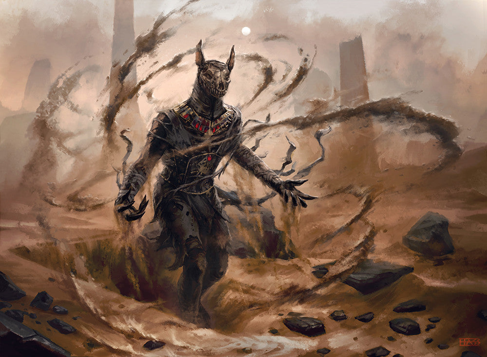
This week we shine the spotlight on the Dread Wanderer by Josh Hass from Amonkhet.
Take it away Josh.
This piece, originally entitled "Unappeasable Dead" when I received it from Wizards, began, as always, with the art description.
Action: This is a black-aligned mummy jackalfolk that is triumphantly, dramatically rising from his sandy grave. He raises his decrepit arms with dark majesty, and black sands swirl around his feet like a personal necromantic tornado. His ancient rags flap in the winds as he rises from death yet again.
Focus: The undead ainok
Mood: Ominous, unstoppable. Like a zombie version of the Egyptian god of death, Anubis.
I don't think I hit the unstoppable mood requirement all that well. It's certainly a zombie version of Anubis though, which is what I took away as the most important bit of direction.
For reference I took a couple snapshots of myself in my skivvies, which I will not subject the Internet to. Wizards also provided concept art for the general look of the jackalfolk. For the ominous mood requirement, Google image search came in handy with sandstorm references. But for the most part I chose to wing it on the desert environment.
For all my card illustration work I start by sketching out the main figure keeping in mind that these will be scaled down significantly. The goal is to capture strong silhouettes that can be recognized quickly upside down from across a table.
My painting process starts with the main figure as well. I keep the detail tight and the contrast high on the focal point and kind of let it go for everything else. The backgrounds and supporting elements are usually much more loose and with a narrower range of values.
If you squint your eyes you can see the highest area of contrast is right around the zombie-mummy so that it "pops" and catches the eye.
The sketch I submitted is pretty standard for my work with Wizards; line-work with very rough values. Except for this illustration I put a bit more work into the sandy environment. Sandstorm and desert is hard to convey with line-work, so I felt obligated to work the sand a bit more to convey the ominous feeling.

After sketch approval I move on to the value and color study. Working in grey-scale, I'll push the sketch further by dropping in values that generally make sense for the given light sources and finalize the design and details of the illustration. I sneak up on color by using the find and replace color tools of Photoshop.

Once the color study is complete the fun starts.
I'll flatten the image and make a brown/sepia copy of it that I'll paint the final illustration on top of. On new layers above the brown/sepia layer, I'll completely repaint the illustration much like an oil painting, using the color dropper on the color study to grab color/value combinations as opposed to mixing paint.
This process helps me fix issues with the sketch, define forms and work in all the juicy details as I move along to the final. Depending on the colors in the piece, sometimes the brown/sepia layer shows through in places giving a more traditional look overall.


For this particular illustration, the one exception to my usual process is that I put much more work into the sand in the sketch phase of the piece.
Normally my sketches are left pretty flat. Due to the extra work this time, I was able to use a lot of the background from my color study avoiding the step of painting it again.

A little more work painting on top of the color study for the background.

Final adjustments usually involve tinkering with the values of the illustration by using the levels adjustment tool in Photoshop.

Amonkhet was a blast to work on. The in house artists put a ton of effort in creating the world and fleshing out the characters. It's easy to riff off of Ancient Egyptian cultures, but looking through all the concept art, they really did create something big and unique that has that Magic the Gathering feel to it.
I recommend grabbing the Art of Amonkhet book if they publish one like they have for other planes.
As much as I liked working on Amonkhet, I wish I could have dug into more projects for Shadows over Innistrad. The forever autumn and Gothic-colonial feel of that world really inspires awesome ideas and daydreams for me.

The original artwork for Dread Wanderer was created digitally.
You can check out Josh's portfolio and learn more about his work at his Website.
Thank you Josh for sharing this story with us.
Check back next Thursday for more Art in Focus.
Sign up to get the latest on sales, new releases and more …