Products

Art in Focus - Spell Pierce Invocation by Joseph Meehan
May 25, 2017 4 min read 0 Comments
The creative process behind each piece of Magic art is unique to the image and the artist.
From the art description to the final product, the Art in Focus series reviews every step involved in crafting the art of Magic the Gathering in the artist’s own words.
This week we shine the spotlight on the Spell Pierce Invocation by Joseph Meehan from Amonkhet.
Take it away Joe.
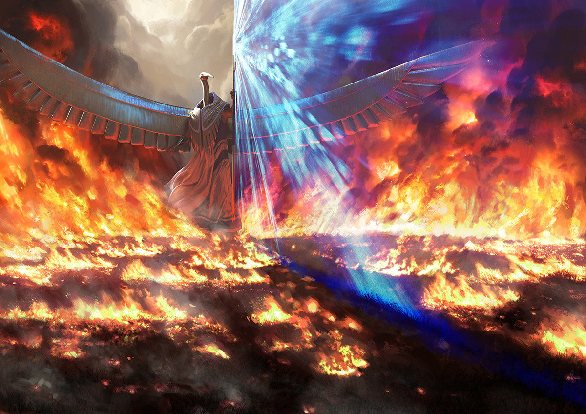
The art direction for this piece was fairly minimal, basically, "show a wave a fire rushing at Kefnet and him parting the flames with this wings", the most important being element to make it clear that he was parting the flames, because that relates the the card mechanic.
Now is a probably good time to mention that this art was actually done for Pact of Negation, but when it came out I was surprised to see it on Spell Pierce.
I didn't refer to the original printing at all, that being Pact of Negation, as I think Wizards typically wants reprints to be totally different to create variety.

This image incorporated a lot of 3D. I built him largely in Zbrush and poser, mainly because his metallic surface reflecting all that fire is the kind of thing that would be very hard to fake or get reference for but 3D tools make very easy.
Also, a big wide pair of outstretched wings can be used to create some very dynamic compositions, where the closest wings is looming close to the camera and the distant wing is much small by comparison.
When you build them in 3D and load them into a renderer, in my case Keyshot, you can rotate the camera and adjust the focal length to get the perfect angle, that really goes for anything you build in 3D though.
Even for the fire I built a 3D mockup of the basic path the fire would be taking, which was very useful in creating the composition and I could then make into a light source to light my model in keyshot. This of course is not visible in the final image
For the actual painting part I used pictures of fire, oil fires, and brush fires, and tried to get some good images of sunlight passing through smoke.
All the while I was focusing on trying to get that damn mechanic to read clearly.
The image is very simple, from one perspective, because it's only a single figure, with a costume already designed for me, with a bunch of fire around him.
The first thing I did was create a simple mockup in 3D, which you can see above, to get the perspective without going to the trouble to build anything myself, just using crude shapes, and then did a sketch based on that.
Later on a spent some time building his wings, chest piece, head, staff, and even his fabric skirt in 3D.

As you can see in the original sketch there is some city visible in the background, but I decided to remove that to make the image as clear as I could. This was mainly because the mechanic of a wave a fire rushing at him and him parting it with his wings is a deceptively tricky one to make clear.

The feedback I got was how would the viewer know he wasn't making the flames himself.
They suggested adding a sort of blue glow showing where his wings parted the flame but it wasn't working out. Since the image is so simple and I had so much of it built in 3D I suggested creating a completely new image, where I rotate the camera so we get a clearer view of the gap he is creating between the flames.

Hence this unusual case of two finals. Now, even then it wasn't completely clear, so I decided I need something to make this obvious and I put that blue beam coming out of his staff. Color is a good way to show who's doing what, fire his orange, his magic is blue, so there's no way hes creating the fire.
This beam is what I believe led to the art director making the choice to use this art for Spell Pierce instead of Pact, as it does work better for that ultimately.
I'll admit that I don't love this piece, I actually like the first version better, but I understand their concern. Ultimately the mechanic is what you need to illustrate clearly. That being said I think the blue beam is the most successful element, because it made things clearer.
Overall, illustrating in the world of Amonkhet feels great as I've always liked the Egyptian aesthetic. The buildings are especially fun. Big, simple shapes made of sandstone, meaning they are easy to build, always look huge and monolithic, and you get that lovely combination of tan in direct light, blue in ambient light, and a sort of umber color in the bounce light. I was also honored to be asked to do four Invocations.
I think Amonkhet is my favorite world to create for so far, once again because I've always like the Egyptian Aesthetic, especially the colors.
If you enjoy my work, I'll be at the Grand Prix in Vegas, selling prints and proofs and signing stuff and everything else that goes into that. Also, keep an eye out for my art in Hour of Devastation!
The original artwork for Spell Pierce Invocation was created digitally.
You can check out Joe's portfolio and learn more about his work at his ArtStation.
Thank you Joe for sharing this story with us.
Check back next Thursday for more Art in Focus.
Enjoyed the Article? Support the OMA Store
Subscribe
Sign up to get the latest on sales, new releases and more …
